
Branding and Logo Best Practices
/When it comes to great design, nearly every tried and true component has a caveat. While this does make it difficult to hammer down what exactly makes the perfect logo or branding guide, this ambiguity should also encourage artists, graphic designers, and their clients to bend the rules, explore the canvas, and find a symbol that accurately captures the business and/or industry at hand.
TL;DR
Graphic designers are translators
Circularity and angularity have a significant impact on customer perceptions of a brand
Consider your customers, products, and services more than your personal preferences
Don’t overemphasize with bold, italics, or underlines
The emotional connection with color is important to consider
The Language of Logos
“I always say designers are translators,” notes Megan Callaghan, founder of graphic design company, Method & Medium. But what is it exactly that is being translated?

Megan Callaghan, graphic designer
From a business’s culture and location to their attitude and trade, a good logo tells a snapshot-sized story about a business while providing a compelling enough visual for people to easily recall the brand. “A logo needs to stand for everything,” asserts Callaghan. “It’s going to be one of the first things your customers see and the first thing they’ll remember.”
Connotations of Angles and Curves
“If you want your business to seem softer, calmer, and more approachable, you might want to round your corners. If you have a ‘sharp’ logo, it may not seem as warm, but sleeker, stricter, and more business-like,” conveys Callaghan. Interestingly enough, this premise has its basis in psychology: supporting Callaghan’s theory, a study by the Association for Psychological Science (APS) found that circularity and angularity were major indicators of consumers’ perceptions of a company, product, or service.
To most people, curves connote “softness” whereas angular shapes are associated with “hardness.” However, these simple perceptions can lead potential customers to some pretty significant assumptions. The APS found that “people make complex assessments of a company or product based merely on the shape of the logo.”
Simply stated, curvy logos make a brand seem more caring, warm, and sensitive to the customer’s needs. On the flip side, angular logos exhibit a stronger, tougher, more durable brand.
To highlight the influence of curvature on a customer’s feelings, APS ran a simple experiment. 109 participates were asked to rate the comfortability level of a new pair of running shoes. While the sneakers were all the same, there was differentiation in the branding: circular logo, angular logo, no logo. The participants who wore the running shoes with the circular logo rated the product as more comfortable than the other two groups.
“You want to make sure your logo means something,” Callaghan states matter of factly, “design without purpose isn’t design at all.”
Meaning and Aesthetic vs. Preference and Influence
While a logo should mean something, this doesn’t mean you will have some deep, existential connection with your logo. However, it is necessary that you consider your products and services rather than your favorite colors, preference for using all caps, and/or logo inspiration from companies in completely unrelated industries.
“I run into this problem frequently where business owners forget the logo isn’t for them, it’s for everybody else. Your personal preferences don’t have to totally disappear, but there are times when you have to step on the other side of those preferences and remember who your target audience is.”
As many business owners can probably attest, they’re so deeply connected to their products and services that when it comes time to create a logo, they’re too close to the company to remember the brand isn’t necessarily for themselves, it’s for their clients.
“If you forget to think about your audience and your goals, you’ll wind up with a very disconnected brand that’s just a bunch of elements that you like, but don’t necessarily work together,” Callaghan contends. “It might not be your favorite color, it may not have your favorite script font, but if it touches on everything that you want your customers to feel and it accomplishes your goals, you’ll still like it.”
Callaghan has witnessed the process of establishing a brand (or rebrand) rekindle the drive and excitement stemming from why the company was founded in the first place. For her, it’s one of the most rewarding aspects of design.
Branding in Conjunction with Content

Radius Cowork Branding (2018)
“I rarely make branding where the body’s content and background is pure white or pure black,” Callaghan says. “Most often, I’ll give someone an almost indistinguishably off white and off black… It makes the branding warmer or cooler.”
Callaghan says this is because shades of black and tints of white are as versatile as colors themselves. You can make black look warmer, cooler, lighter, and yes, darker.
“It’s an optical illusion,” states Callaghan. “It depends on what colors you put next to each other… If you were to show a typical website to most people, and asked them what color the text is, they’ll probably say black.” Interestingly—despite appearances—most websites’ backgrounds aren’t true white, and the text isn’t pure black. If it is, it probably looks harsh, stark, and default.
To help with this issue, try tinting an accent color until it appears white. This will enable you to control the warm (be careful with warm tones as the can make backgrounds look dingy) or cool tones on your site. Same goes for your text; test out a charcoal or navy in place of pure black.
Bold, Italics, Caps, and Underline
Although it may be obvious to some, bolding text is meant to emphasize a word, phrase, or sentence. On your website or marketing material, this may include headings, subheadings, or be part of your logo. Alternately, when it comes to your body content, you can show emphasis through italics depending on the voice you’re trying to achieve.
It should also be noted that you can easily overemphasize your text to the point where nothing is emphasized. For this reason, ease up on bold and italics for the sake of your readers’ retinas and graphic designers’ hearts.
“As far as bold goes, you may not need it depending on your colors. Bold tends to be louder. Same with all caps,” says Callaghan. “You can use bold and all caps without ‘screaming,’ but may not need them together.” This rule of mutual exclusivity should stand true for italics and underlines as well.
When you’re online, underlines can be exceptionally confusing as these words may appear to be links. In fact, many CRMs do not have an underline function just to avoid this confusion. For the most part, you should show emphasis through italics and save your underlines for when your handwriting.
The Colors, Duke, The Colors!
According to Research by Touro College, color increases brand recognition by up to 80 percent. What’s even more interesting is that color has a “significant impact on sales since ‘people make a subconscious judgment about a . . . product within 90 seconds of initial viewing and . . . between 62% and 90% of that assessment is based on color alone.”
Each color has an emotional connotation or feeling associated with it. To help you understand some of the basic undertones of each color, take a peek at the chart below:
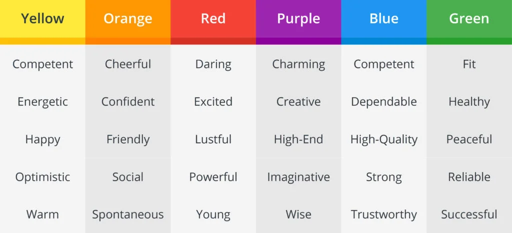
How do different colors make people feel?
“I think the connotations of color stand true when they’re by themselves. When you begin to pair them, you’re in a whole different world,” says Callaghan. “A cool silver may connate wealth and sleekness, but if you put it next to some warm, earthy greens, you don’t necessarily get ‘posh-organic.’ Part of the palette process is navigating between harmony and discord to find that perfect combination of hues, tints, and shades.”
Design Something Timeless
When it comes to logo design and branding, it’s important to create a mark that has longevity. Make it adaptable, appropriate, and customer-focused. “Think about the platforms you’ll be using and how those platforms are constantly changing. Your mark should be ready to keep up,” Callaghan notes.
Consider the kind of products and services you provide and be sure that the colors, size, and shape fit your business and our target customers. If you’re curious about Callaghan’s thoughts on your brand or if you think you may need a brand refresh, take a trip over to her website to learn more.

Method and Medium